

Embedding
Embedding Voiceform into Your App
Integrating Voiceform into your app is straightforward. Follow these steps:
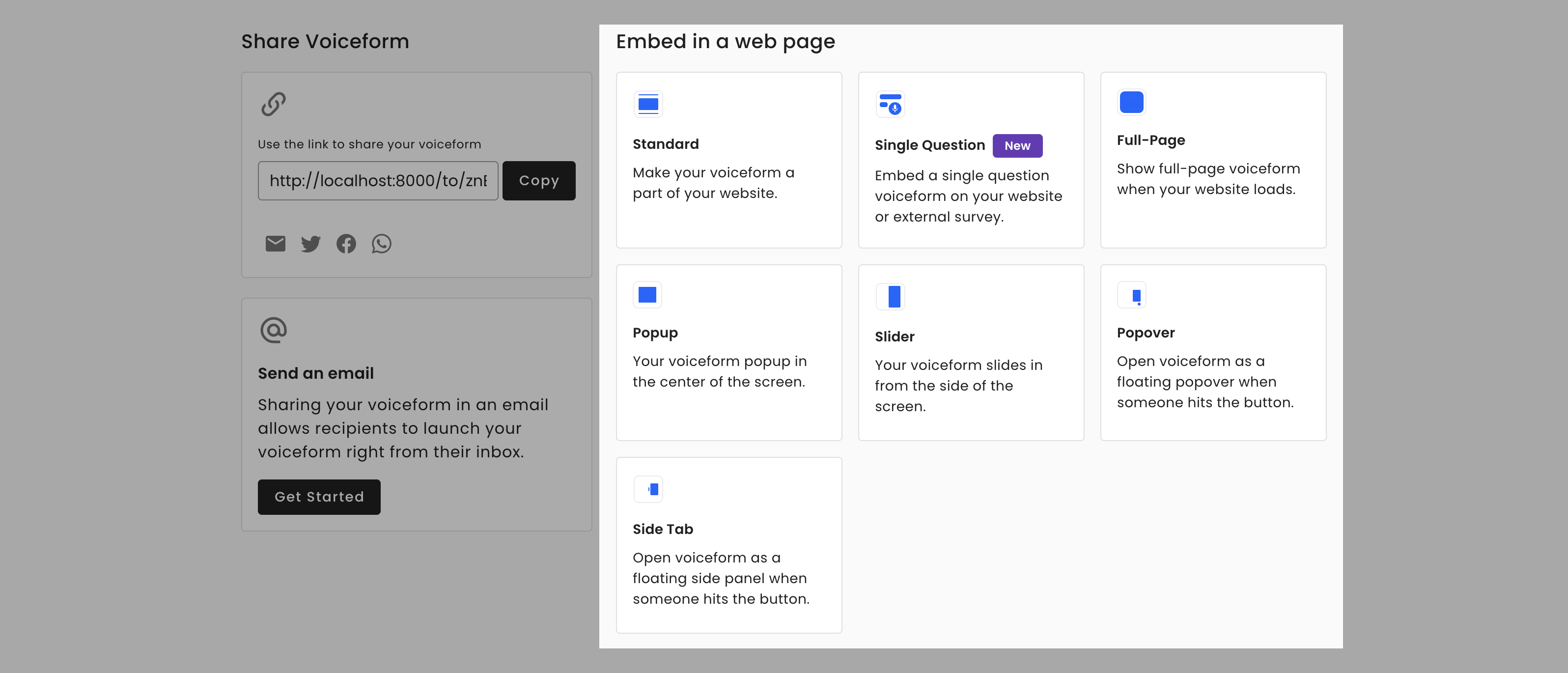
- Navigate to the Share tab of your survey.
- Locate the section labeled "Embed in a web page."
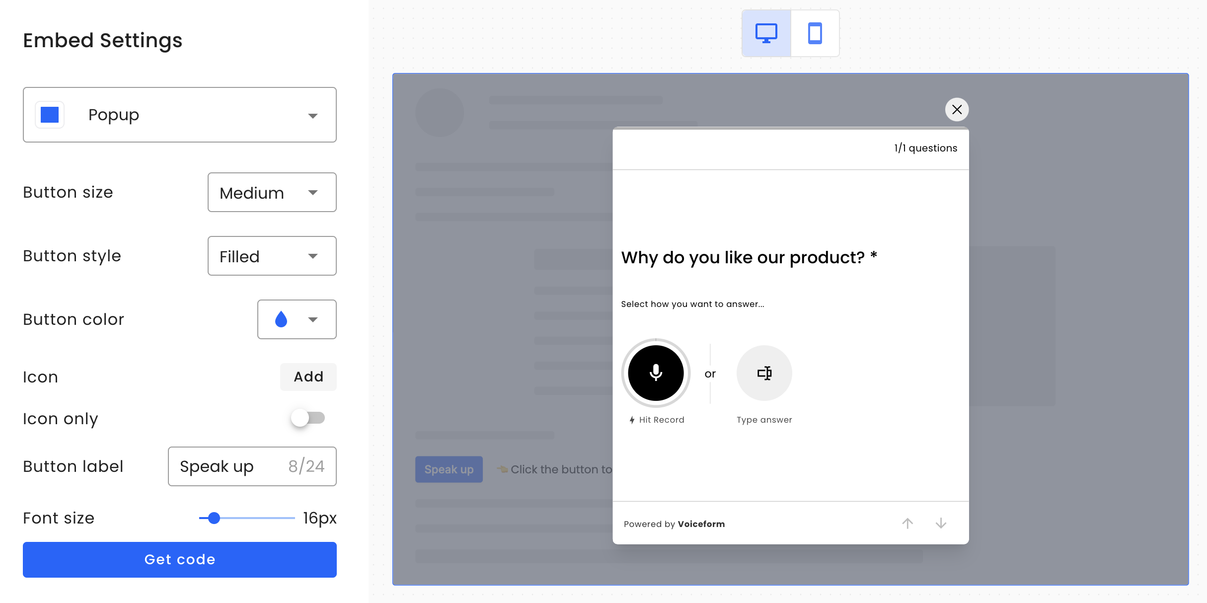
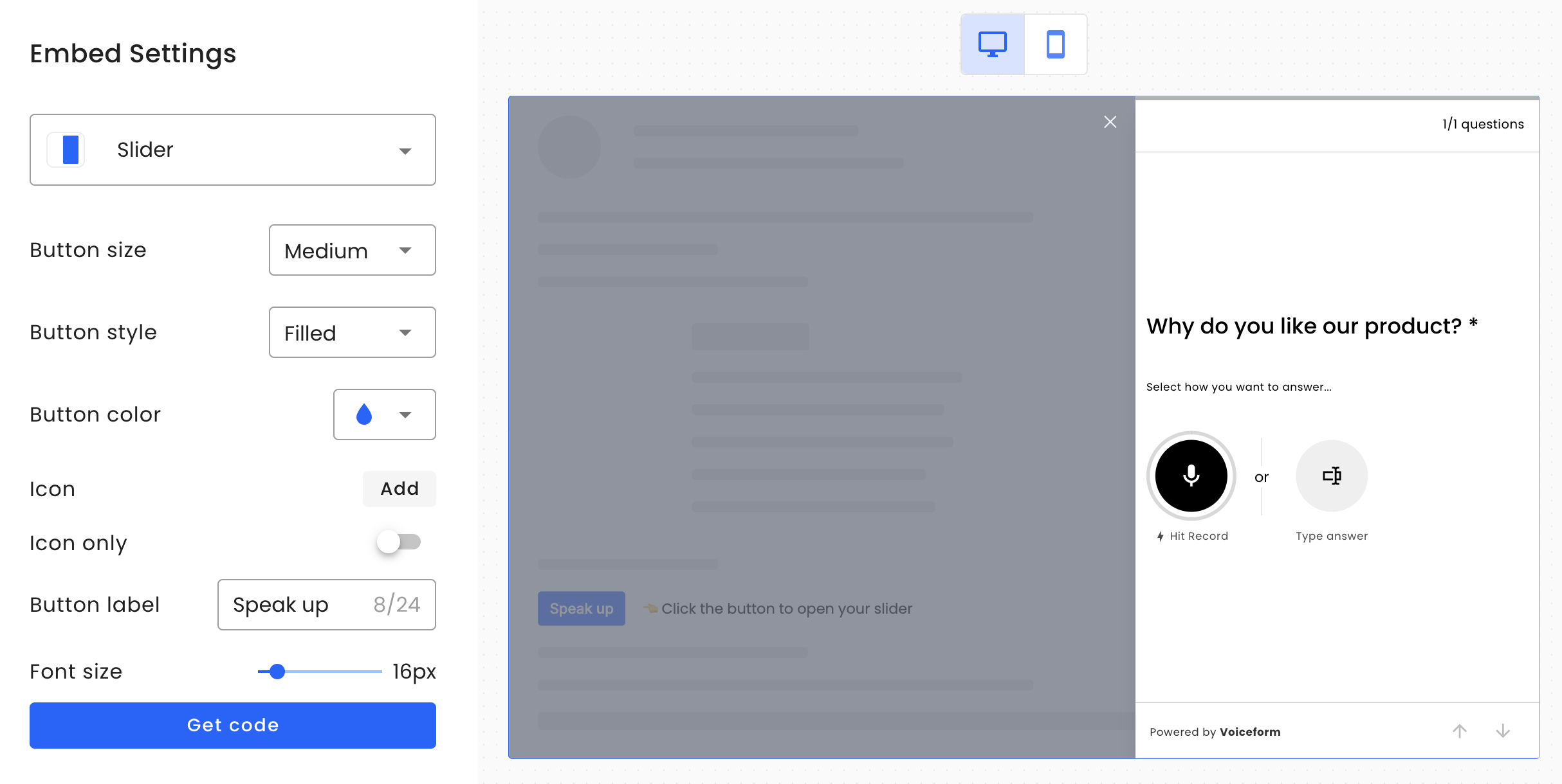
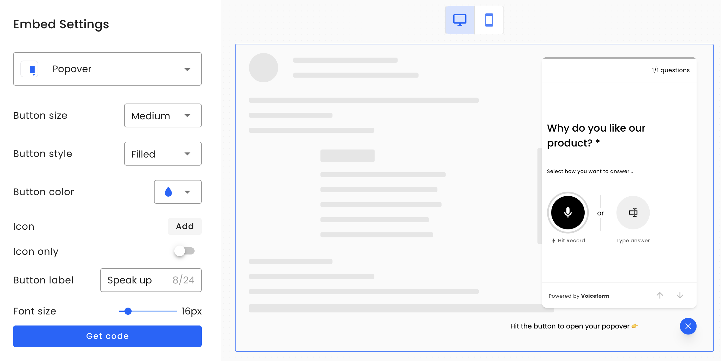
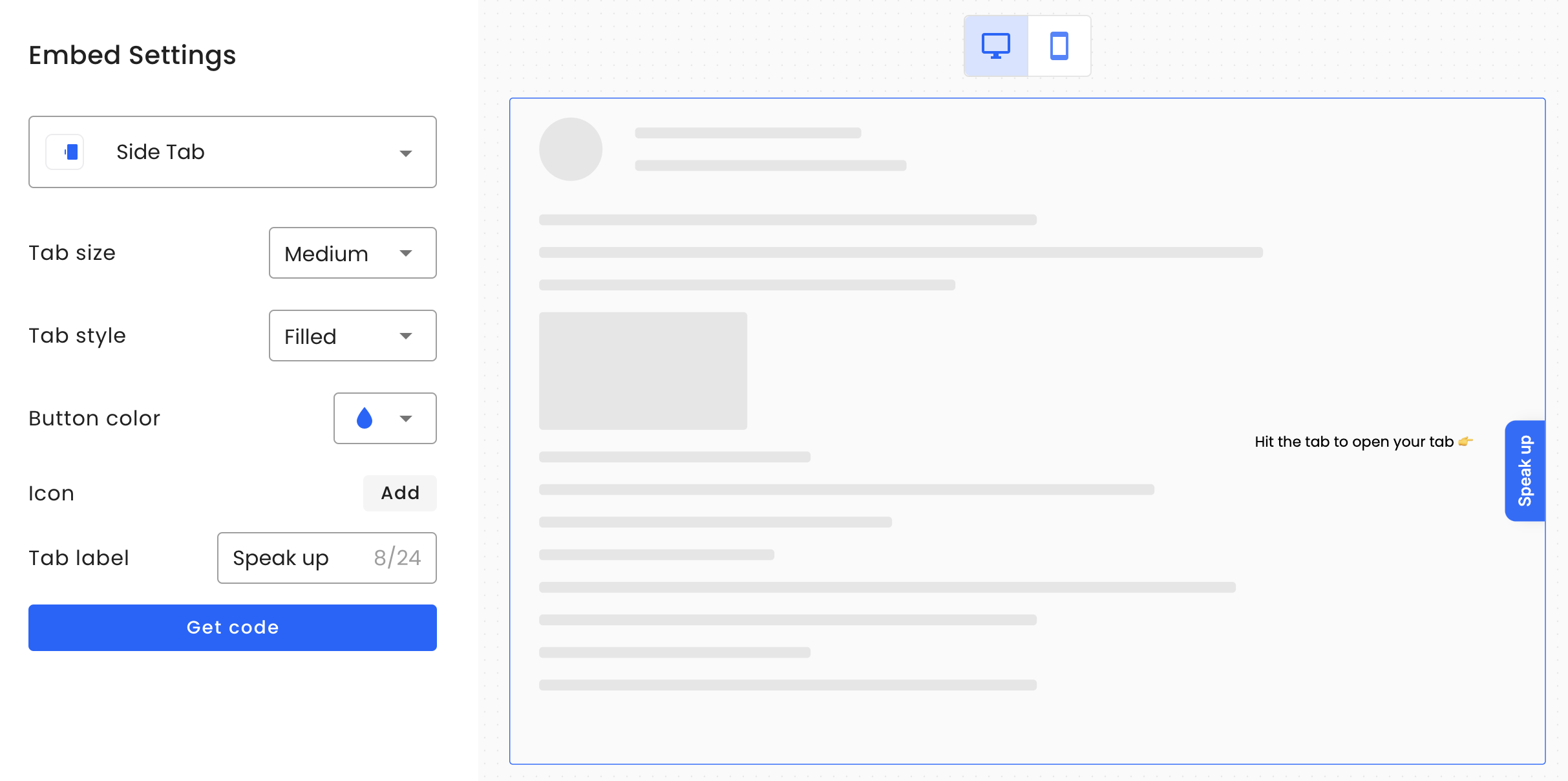
- You will find six embedding options available: Standard, Single Question, Full-Page, Popup, Slider, Popover, and Side Tab.
- Select one of the options and configure it using the available settings under Embed Settings.
- Click the "Get code" button, then copy the generated code.
- Paste the code into your webpage.
For detailed information on each embedding type, please continue reading the document.
Embedding Types
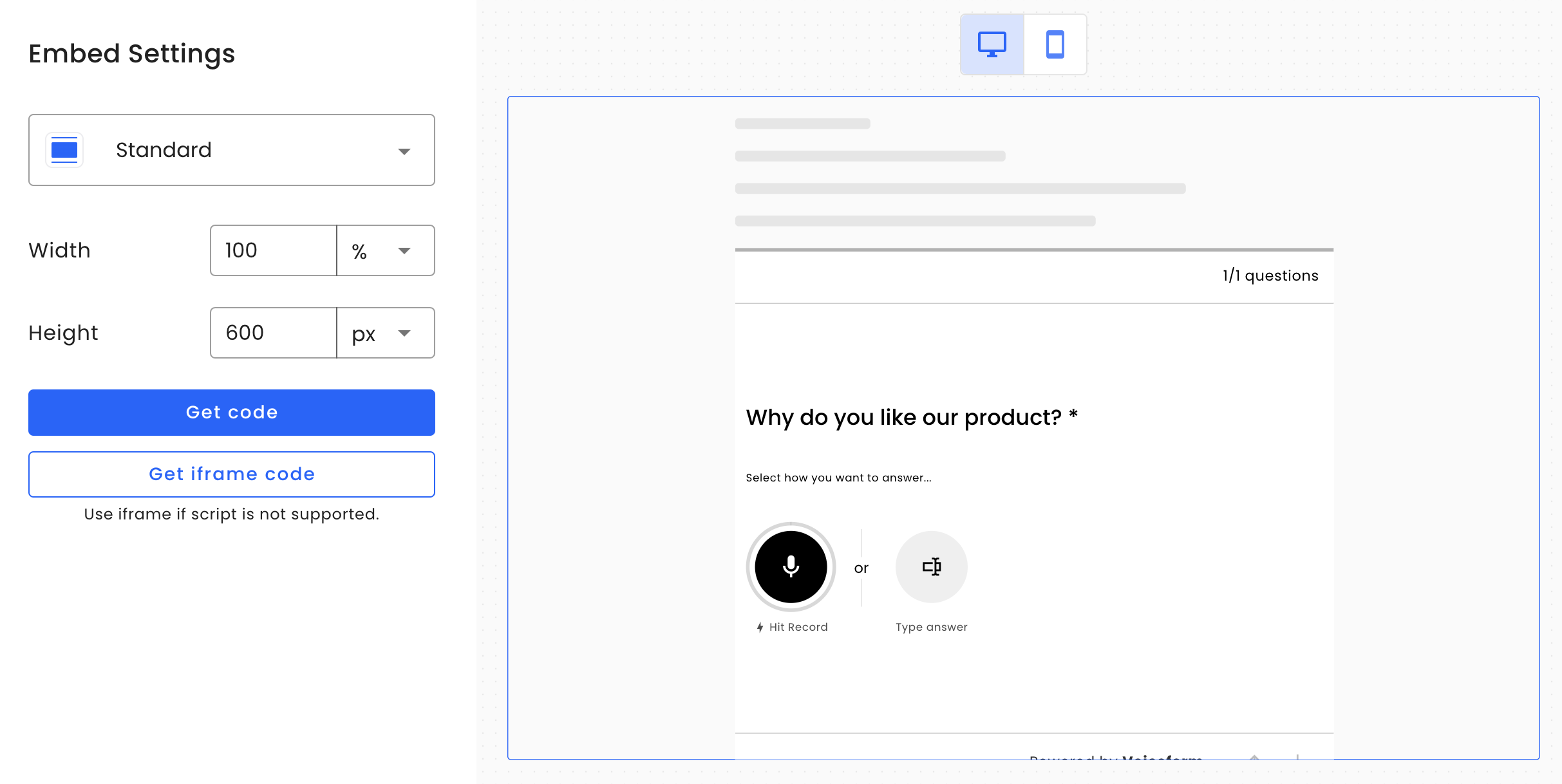
Standard Type
The Standard widget (data-mode="standard") displays the survey as part of you website content. Useful if you want to make a survey as one of the section on ypur website. In case if for some reason your web page does not allow passing a <script> tag, we allow using "Get iframe code" button that will load the survey as an iframe embedding similar to how you would embed a YouTube video.
Widget Properties
| Property Name | Default Value | Code Attribute | Description |
|---|---|---|---|
| Width | 100% | data-vf-width | Sets widget width. |
| Height | 600px | data-vf-height | Sets widget height. |
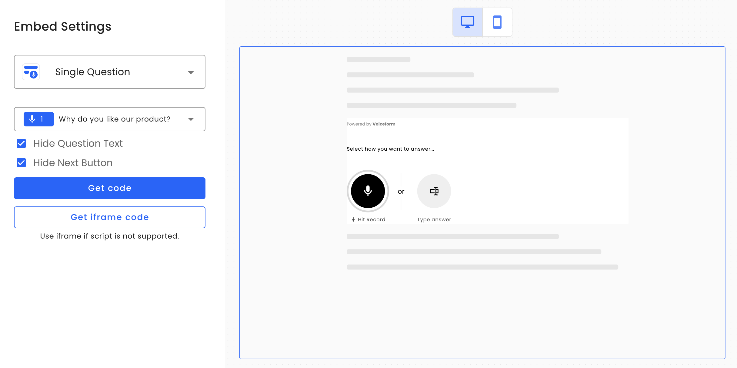
Single Question Type
The Single Question widget (data-mode="single-question") is similar to the Standard widget type, but it allows you to embed only one question at a time. This option is commonly used when you want to integrate Voiceform into another survey or form experience. The widget automatically adjusts its height based on its content. If you cannot use a <script> tag, you may use the “Get iframe code” option; however, in that case, the height will be static.
Widget Properties
| Property Name | Default Value | Code Attribute | Description |
|---|---|---|---|
| Question | data-question-id | Sets the ID of the displayed question. | |
| Hide Question Text | false | data-vf-hide-question | Hides the question text. |
| Hide Next Button | false | data-vf-hide-next-button | Hides the "Next" button. |
| Response ID | data-response-id | Links answers to a unique response ID, ensuring accurate mapping when multiple widgets are used. | |
| Language | Main language setting | data-lang | Sets the question language using a two-letter code (e.g., en, fr, es). |
| Note: Translations must be set in survey settings—otherwise, only static labels are localized. |
About Response IdThe
data-response-idorresponse_idattribute in your metadata is a special identifier used by our system to map answers to a single response. Please ensure that this value is unique and used correctly according to your business logic. Example: Embedding Multiple Widgets with Mapping to a Single SubmissionNote: At this time, providing a response ID does not prevent multiple submissions if a single-question widget is used. Each submission will still be treated as a separate entry.
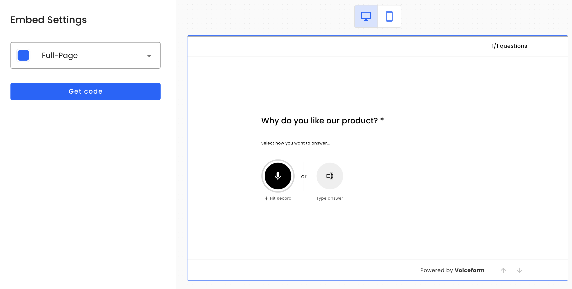
Full-Page Type
The Full-Page widget (data-mode="popup") is used when you want the survey to occupy the entire web page. This option is commonly used when you want to host the survey on your own domain and serve it directly from there.
Popup Type
The Popup widget (data-mode="popup") is designed to overlay the page and appear as a dialog module. This widget also includes a customizable triggering button, which can be placed within any content on your page.
Widget Properties
| Property Name | Default Value | Code Attribute | Description |
|---|---|---|---|
| Button Size | medium | data-vf-btn-size | Size of the triggering button. Options: small/ medium/ large. |
| Button Style | filled | data-vf-btn-style | Style of the triggering button. Options: filled/outlined/ text. |
| Button Color | #0066FF | data-vf-btn-color | Background color of the button. |
| Icon | data-vf-btn-icon | URL to the icon image for the triggering button. | |
| Icon Only | false | data-vf-btn-icon-only | Removes the text from the button, making it icon-only. Options: true/ false. |
| Button Label | Speak up | data-vf-btn-label | Text label of the button. |
| Font Size | 16px | data-vf-btn-font-size | Font size of the button text. |
| Rounding | 4px | data-vf-btn-border-radius | Border radius of the button |
| Overlay Z-index | 10 | data-vf-overlay-z-index | The z-index css attribute that is used for for popup overlay. |
Slider Type
The Slider widget (data-mode="slider") is similar to the Popup widget, but instead of overlaying the entire page, the form slides in from the right side of the screen. It also includes a customizable triggering button that can be placed anywhere within your webpage content.
Widget Properties
| Property Name | Default Value | Code Attribute | Description |
|---|---|---|---|
| Button Size | medium | data-vf-btn-size | Size of the triggering button. Options: small/ medium/ large. |
| Button Style | filled | data-vf-btn-style | Style of the triggering button. Options: filled/outlined/ text. |
| Button Color | # 0066FF | data-vf-btn-color | Background color of the button. |
| Icon | data-vf-btn-icon | URL to the icon image for the triggering button. | |
| Icon Only | false | data-vf-btn-icon-only | Removes the text from the button, making it icon-only. Options: true/ false. |
| Button Label | Speak up | data-vf-btn-label | Text label of the button. |
| Font Size | 16px | data-vf-btn-font-size | Font size of the button text. |
| Rounding | 4px | data-vf-btn-border-radius | Border radius of the button |
Popover Type
The Popover widget (data-mode="popover") adds a floating button to the bottom right corner of the screen. When toggled, the survey will pop up in a manner similar to a customer support chat button. This widget is commonly used for customer support or for collecting feedback.
Widget Properties
| Property Name | Default Value | Code Attribute | Description |
|---|---|---|---|
| Button Size | medium | data-vf-btn-size | Size of the triggering button. Options: small/ medium/ large. |
| Button Style | filled | data-vf-btn-style | Style of the triggering button. Options: filled/outlined/ text. |
| Button Color | # 0066FF | data-vf-btn-color | Background color of the button. |
| Icon | data-vf-btn-icon | URL to the icon image for the triggering button. | |
| Icon Only | false | data-vf-btn-icon-only | Removes the text from the button, making it icon-only. Options: true/ false. |
| Button Label | Speak up | data-vf-btn-label | Text label of the button. |
| Font Size | 16px | data-vf-btn-font-size | Font size of the button text. |
| Rounding | 4px | data-vf-btn-border-radius | Border radius of the button |
Side Tab Type
The Side Tab widget (data-mode="side-tab") is similar to the Slider widget but features a fixed-position toggle button on the right side of the screen.
Widget Properties
| Property Name | Default Value | Code Attribute | Description |
|---|---|---|---|
| Tab Size | medium | data-vf-btn-size | Size of the triggering button. Options: small/ medium/ large. |
| Tab Style | filled | data-vf-btn-style | Style of the triggering button. Options: filled/outlined/ text. |
| Tab Color | # 0066FF | data-vf-btn-color | Background color of the button. |
| Icon | data-vf-btn-icon | URL to the icon image for the triggering button. | |
| Tab Label | Speak up | data-vf-btn-label | Text label of the button. |
Passing Custom Attributes
Sometimes, you might need to pass custom attributes into a survey, such as metadata or the value of a dynamic variable. There are two ways to pass this data:
Option 1: Passing Metadata through Custom Attributes
You can pass metadata by adding a custom attribute to the <vf-widget /> element. For example, if you want to pass a respondent's email into the survey metadata, you would include a custom attribute with the data- prefix, like data-email="". The email attribute will then be passed as a query parameter to the survey link.
Example:
<vf-widget
      data-vf-height="600px"
      data-vf-width="100%"
      data-mode="standard"
      data-hash="9V7GKLwJs2jkBbMt"
      data-email="[email protected]" <!-- passing custom attribute -->
/>
Option 2: Passing Multiple Data Items Using data-metadata
data-metadataWhen you need to pass multiple data items, you can use the data-metadata attribute. This attribute accepts a JSON string, where each key-value pair will be converted into query parameters for the survey link.
Example:
<vf-widget
      data-vf-height="600px"
      data-vf-width="100%"
      data-mode="standard"
      data-hash="9V7GKLwJs2jkBbMt"
      data-metadata='{"email":"[email protected]", "userId":"12345", "source":"newsletter"}'
/>
In this example, the email, userId, and source keys will be passed as query parameters, allowing you to dynamically include various pieces of metadata in your survey.
Manually Triggering Next
Sometimes you may want to trigger the next or finish button outside of the survey. For example, if you're using the Single Question widget, you can hide the default next button and use your own custom button. To achieve this, you'll need to use the VoiceformJS SDK, which is automatically included on the web page when the widget script is added to the header:
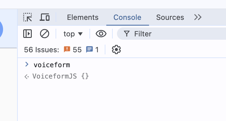
<script src="https://cdn.voiceform.com/widgets/next/widgets.umd.js"></script>To confirm that the SDK is available, you can open Chrome DevTools and type voiceform in the console. You should see the VoiceformJS class as a return value.
The VoiceformJS class has a next method, which requires an HTMLElement as a parameter. In our case, we need to pass the <vf-widget /> element as the parameter. To simplify this, we can assign an id to the widget, like so: <vf-widget id="my-widget" />. Then, we can use document.getElementById to get the HTML element and pass it to the voiceform.next() function.
Please see the example below:
Listening to Survey Events
Voiceform widgets contain an iframe that posts messages to the parent window. You can listen to these message events to implement custom logic based on the survey's state.
Supported Events
The following events are currently supported:
| Message Type | Payload Keys | Description |
|---|---|---|
voiceform.form-submission-loading | type, surveyHash, questionId (only for single-question) | Triggered when a submission is in progress. |
voiceform.form-submitted | type, surveyHash, questionId (only for single-question) | Triggered when a submission is successfully completed. |
voiceform.form-submission-error | type, surveyHash, questionId (only for single-question), errorMessage | Triggered when a submission fails. |
Example: Handling Survey Events
The following example demonstrates how to handle survey events. In this scenario, the survey widget is hidden upon successful submission, and a record of the submission is stored in local storage:
window.addEventListener("message", function(event) {
  // Validate the origin of the message (optional)
  if (event.origin !== "https://app.voiceform.com") {
    return;
  }

  // Process the message based on its type
  switch(event.data.type) {
    case "voiceform.form-submitted":
      // Hide the survey widget upon successful submission
      const surveyWidget = document.querySelector("vf-widget");
      if (surveyWidget) {
        surveyWidget.style.display = "none";
      }

      // Store submission status in local storage
      localStorage.setItem("surveySubmitted", "true");
      console.log("Survey submitted successfully, and status stored in local storage.");
      break;

    case "voiceform.form-submission-error":
      console.error("Survey submission failed with error:", event.data.errorMessage);
      break;

    // Additional cases can be added here as needed
  }
});
Updated about 1 year ago