

Matrix
Matrix Question Type is a structured way to gather multiple pieces of information from respondents in a tabular format. This question type is particularly useful for comparing different aspects of a topic or gathering detailed feedback across several variables.
Video Tutorial
Basic Usage
Adding Rows and Columns
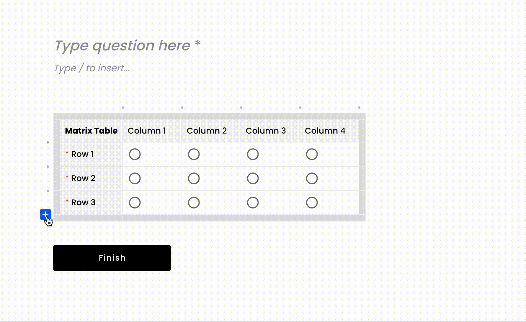
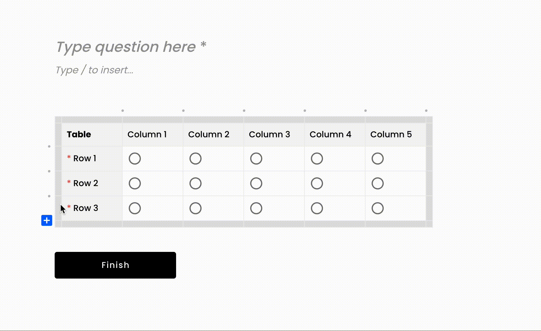
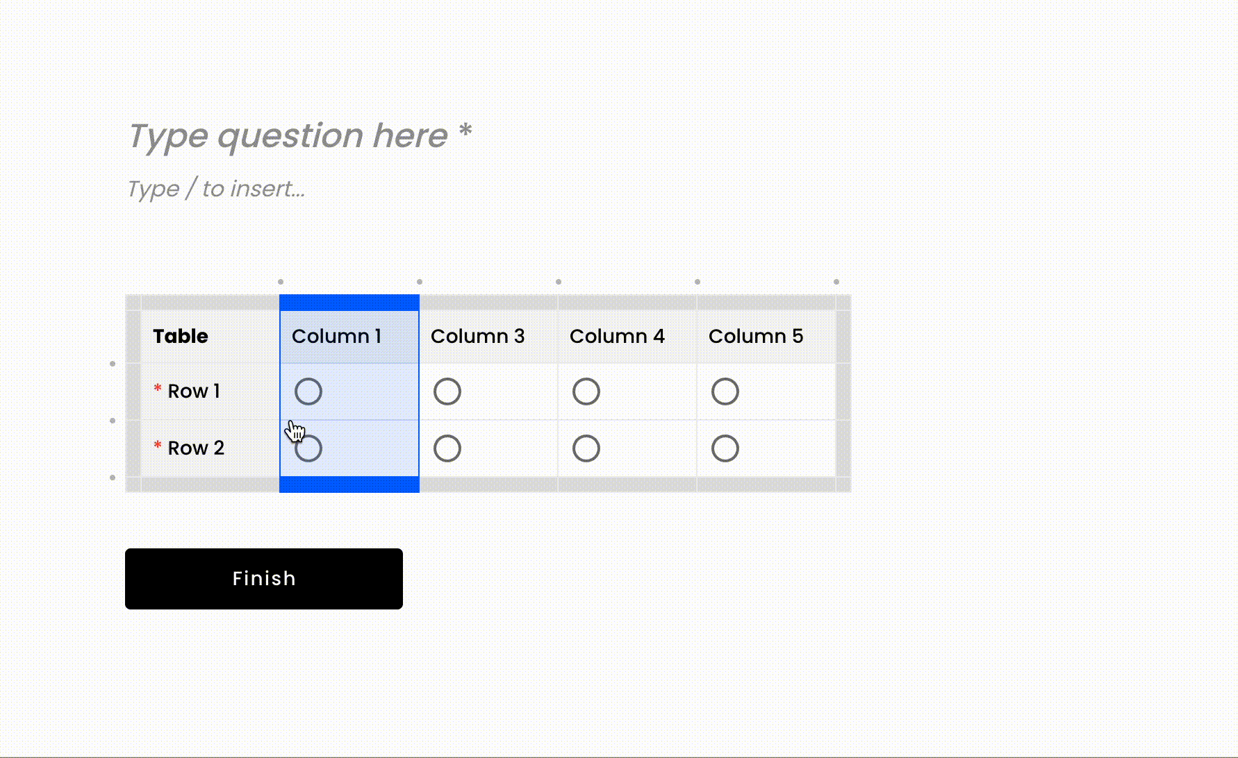
To add rows and columns to a matrix table in Voiceform, simply click on the ‘+’ icon located at the desired location within the table. This action will insert a new row or column, allowing you to expand the table as needed to accommodate more data or options.
Renaming Rows, Column, and Table Titles
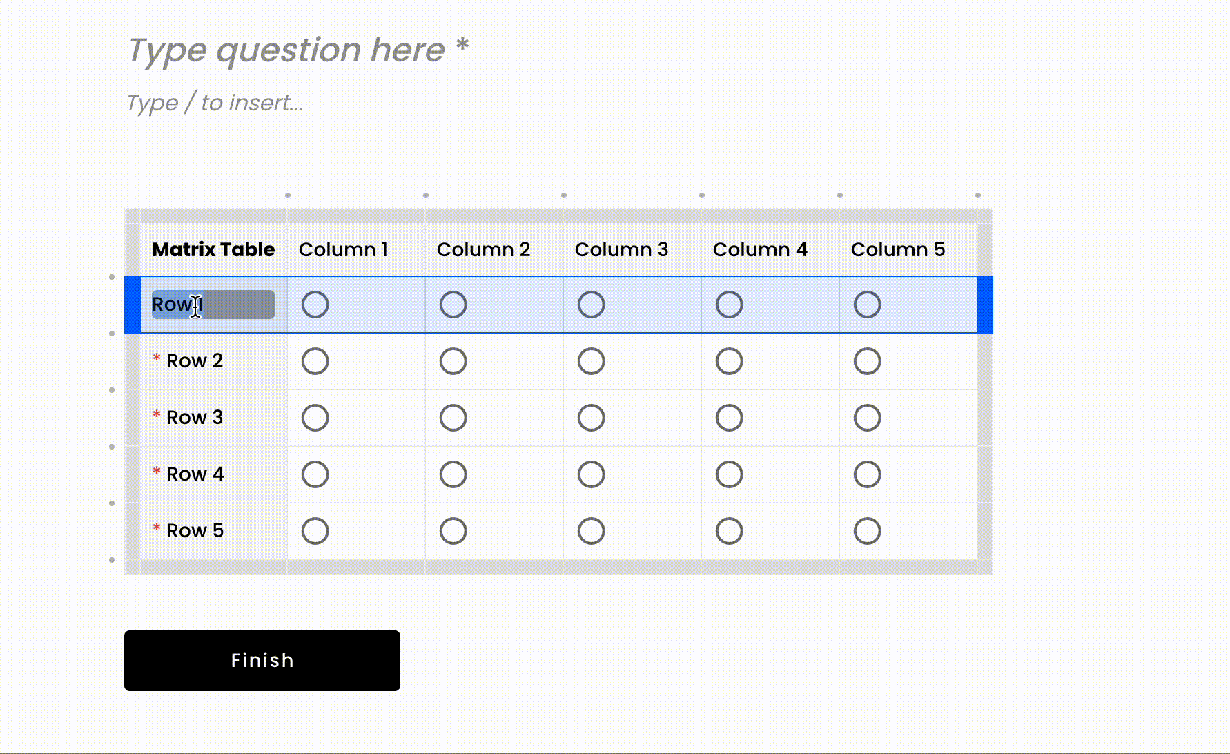
To rename rows, columns, or the table title, click on the text you wish to edit. A cursor will appear, enabling you to type in the new name directly. This feature allows you to customize the table headings to better reflect the content and context of your survey.
Removing Rows and Columns
To remove a row or column from the matrix table, click on the trash can icon next to the row or column you want to delete. This action will remove the selected row or column, allowing you to simplify the table by eliminating unnecessary elements.
Adjusting Column Width
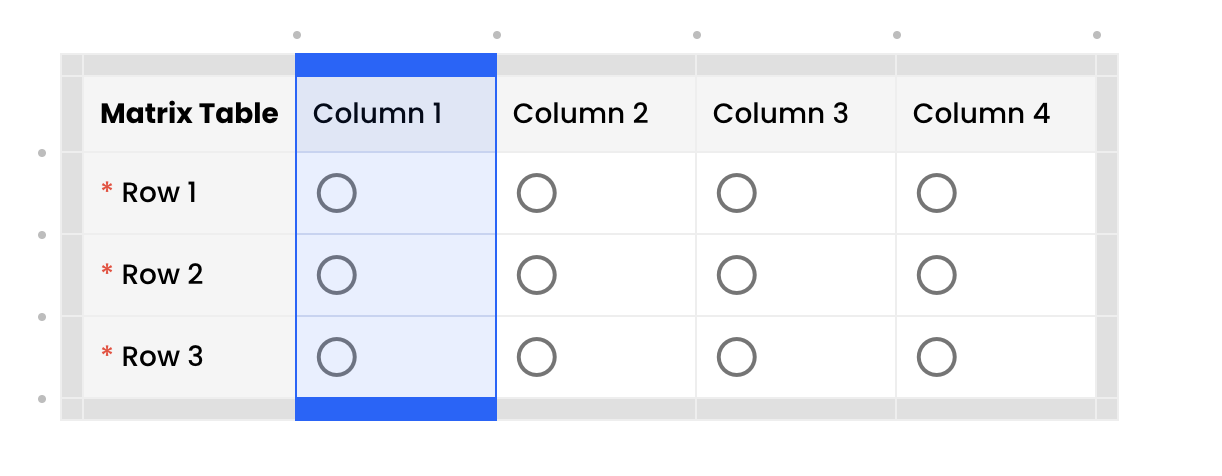
To adjust the width of a column, hover over the boundary line between columns until the resize cursor appears. Click and drag the boundary to the desired width. This functionality ensures that you can optimize the table layout for readability and space management.
Matrix General Properties
Required Property
By default, the matrix question is set to "required," meaning that all rows require at least one value. If you make the question optional, then all the rows become optional.
Required Columns
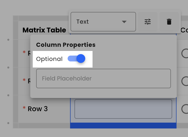
Sometimes, you need to mark a specific column or group of columns as required. For example, if you have three columns with radio buttons and a fourth column with text input. By default, the required row setting allows skipping the text input if a radio option is selected. However, you may want to ensure that respondents provide answers to all text inputs.
To do this, select the column, click on the properties icon button, and toggle off the "Optional" switch. This will make the column required, meaning that even if other values are provided for the specific row, the row will not be considered valid until the required column has a value.
NoteFor radio and checkbox types, which are group-based, the "optional" property applies to the entire group.
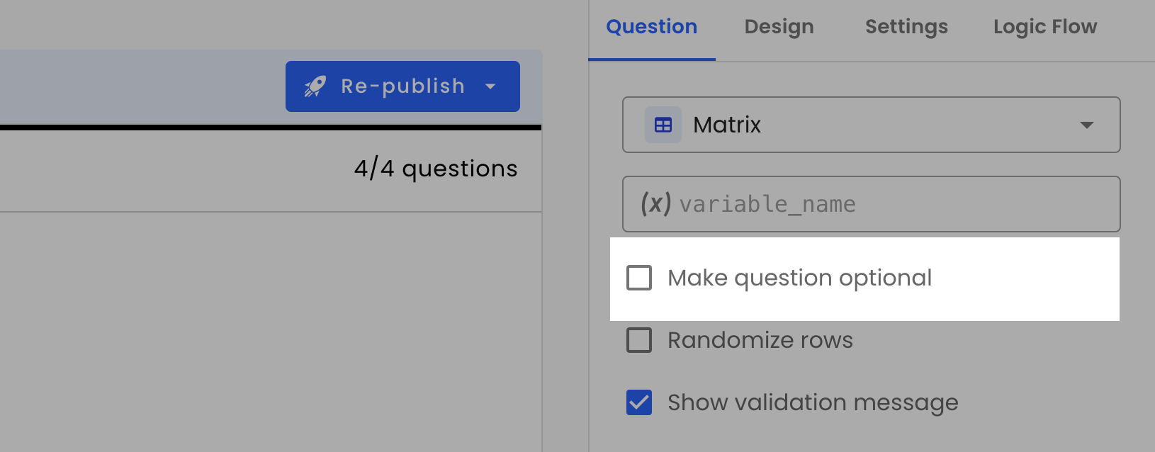
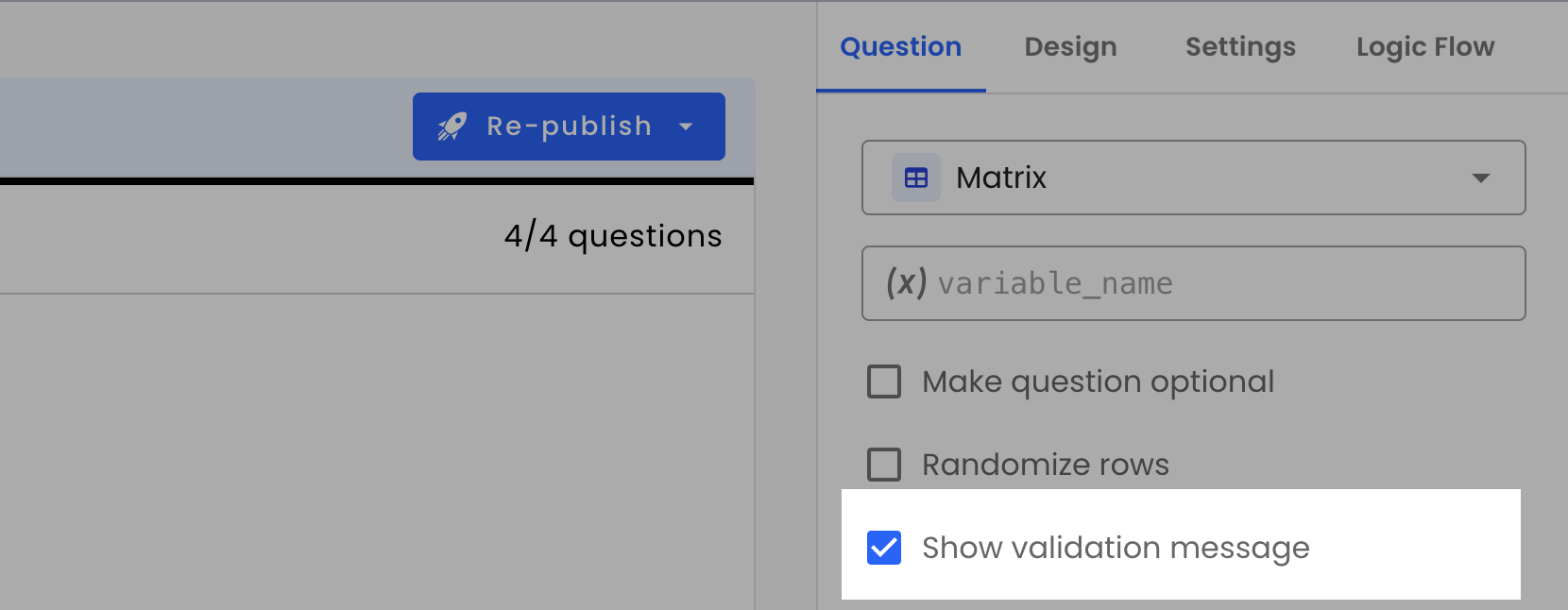
Show Validation Message
If a row is required, a column is required, or if some matrix input is invalid, an explanation message will be displayed at the top of the matrix table. You can uncheck this property to hide the validation message in the UI.
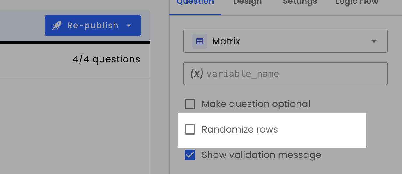
Randomizing Rows
To remove bias, you may prefer to randomize the order of rows. Use this property to shuffle the rows. Select the checkbox to enable row randomization.
Adding Rows Dynamically
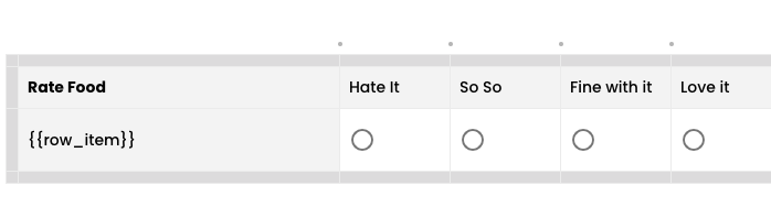
You may need to add rows to a table dynamically. For example, imagine you have a list of 30 food products and want to randomly select 5 of them to generate matrix rows, each with satisfaction options like 'hate it', 'so so', 'fine with it', and 'love it'.
For a simple demonstration, let's hardcode a few food items using a basic loop:
return [['Burger', 'Pizza', 'Ice Cream', 'Cucumber', 'Broccoli']];To dynamically generate rows using a loop_item variable, enter loop_item in the "Row source variable_name" property of the question. This property accepts any existing variable, and if the variable is an array, it will create a row for each element. Keep in mind that you can use any array-based variable as a row source.

To display these dynamically generated rows, create a matrix row and include {{row_item}} in the row header.
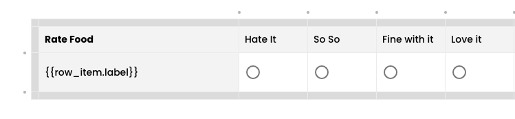
If row_item is an object, you can also access its properties. Here’s an example:
// Loop Action Script
return [[
  {label: 'Burger', dynamic_row_id: 'burger'},
  {label: 'Pizza', dynamic_row_id: 'pizza'},
  {label: 'Ice Cream', dynamic_row_id: 'ice_cream'},
  {label: 'Cucumber', dynamic_row_id: 'cucumber'},
  {label: 'Broccoli', dynamic_row_id: 'broccoli'}
]];
In this case, you can display a specific property like the row label using {{row_item.label}}.
NoteIf your row item object contains a
dynamic_row_id, this ID will be used to assign a unique identifier to the generated rows. Ensure that eachdynamic_row_idis unique to avoid any unexpected behavior.
Limitations
There are certain limitations when generating matrix rows dynamically:
Exports: If a matrix question uses the row source variable property, the export of the matrix to Excel/CSV will be in JSON format, as the number of rows can vary.
Logic Reference: UI-based conditions cannot be applied to matrices with dynamic rows. However, you can still use conditional scripting for logic-based scenarios.
Combining With Defined Rows: Currently, combining static rows with dynamic rows is not supported. If a matrix contains predefined rows, only the first one will be used as a template for data population, and any additional rows will be replaced by the dynamically generated ones.
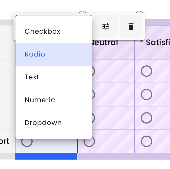
Column Types
There are five column types: "Checkbox", "Radio", "Text", "Numeric", and "Dropdown". To change the column type, select the column you would like to change and click on the dropdown menu to choose its new type.
Radio Column Type
Used for single-choice selection from predefined options. Ideal for questions where only one answer is allowed, such as satisfaction levels or yes/no questions.
Properties:
- Group Name: Assign to a specific group (default:
default_radio). - Optional: Toggle to make the column optional or required.
Checkbox Column Type
Used for multiple-choice selection. Ideal for questions where multiple responses are allowed, such as selecting multiple interests or preferences.
Properties:
- Group Name: Assign to a specific group (default:
default_checkbox). - Optional: Toggle to make the column optional or required.
Adding Multiple Checkboxes and Radio in Matrix Table
Sometimes you would like to have multiple radio/checkboxes in one matrix table. For example in a product feature feedback survey, you might want to gather user opinions on different features of a product. A single matrix question table can be used to capture both the satisfaction level and the likelihood of recommending the features.
Here is the basic setup for your matrix:
Rows: Different features of the product
  •	Ease of Use
  •	Functionality
  •	Design
  •	Customer Support
  •	Columns: Two groups of radio buttons

1.	Satisfaction Level (Group 1)
  •	Unsatisfied
  •	Neutral
  •	Satisfied
2.	Likelihood to Recommend (Group 2)
  •	Unlikely to Recommend
  •	Neutral on Recommending
  •	Likely to Recommend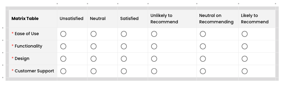
Custom Grouping in Voiceform
By default, all six columns are grouped together. However, we want to create two separate groups. Luckily, Voiceform provides a custom grouping feature! Here's how to create two custom groups: satisfaction and recommendation.
- Creating the satisfaction Group:
- Click on the "Satisfied" column.
- Click on the properties button.
- Create a new group by typing satisfaction in the "Group Name" field.
- Assign the satisfaction group to the "Unsatisfied" and "Neutral" columns.
- Creating the recommendation Group:
- Follow the same process to create the
recommendationgroup. - Assign the recommendation group to the "Unlikely to Recommend", "Neutral on Recommending", and "Likely to Recommend" columns.
- Follow the same process to create the
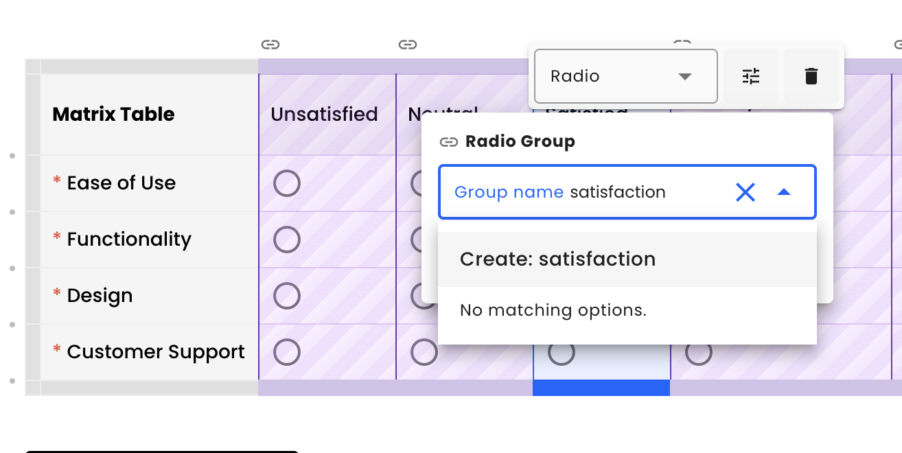
The same approach works for checkbox column type.
NoteBy default, radio type columns are assigned to the
default_radiogroup name and checkbox type columns are assigned to thedefault_checkboxgroup name.
Making Group Required
To ensure that respondents provide a satisfaction rating for each row:
- Click on any column related to the
satisfactiongroup. - Open the properties and toggle off the "Optional" switch.
- The columns in the
satisfactiongroup will now be highlighted with a required * symbol.
That's it! You've successfully set up multiple radio button groups in a single matrix question table, and ensured that one of the groups is required.
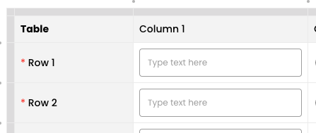
Text Column Type
Used for open-ended text input. Useful for collecting qualitative data like comments, explanations, or detailed feedback.
Properties:
- Optional: Toggle to make the column optional or required.
- Field Placeholder: Set placeholder text.
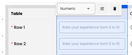
Numeric Type
Used to input numerical data. Ideal for collecting quantitative responses like age, rating scales, or any other numeric input.
Properties:
- Optional: Toggle to make the column optional or required.
- Field Placeholder: Set placeholder text.
- Prefix/Suffix: Add text before or after the input.
- Allowed Range: Set minimum and maximum values.
- Allow Decimal Numbers: Checkbox to allow decimals.
Dropdown
Used to select one option from a dropdown list. Useful for long lists of options or when you want to save space in the survey, such as selecting a country or state.
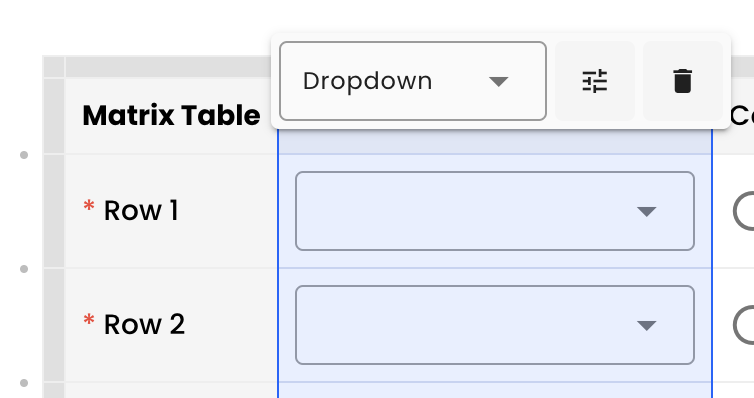
Properties:
- Optional: Toggle to make the column optional or required.
- Options: Define options, add/remove options, and bulk add.